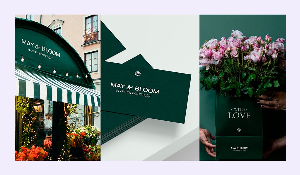
May & Bloom is a flower boutique creating personalized bouquets. They inspire and astonish you with their beauty, show and provoke the whole gamut of emotions.
Kate, the owner of “May&Bloom” brand, tried to design her logo in Canva, but the mark turned out to be a too formulaic pattern, and many other brands used a similar one. She looked and strove for a unique image of the brand to accentuate the originality of her custom floral arrangements and presents.
It is very important for her to look professional and her brand to appeal to customers by demonstrating a high level of skills at this craft. The brand design had to embody a single style that would reflect personality and peculiarity of her bouquets.
We developed a unique mark that would be personalized rather than banal and, at the same time, would imply the field of business. The base for the mark is a flower with an ornament in its center, which resembles petals. It was important for Kate to have not just some symbol but specifically a mark with a flower.
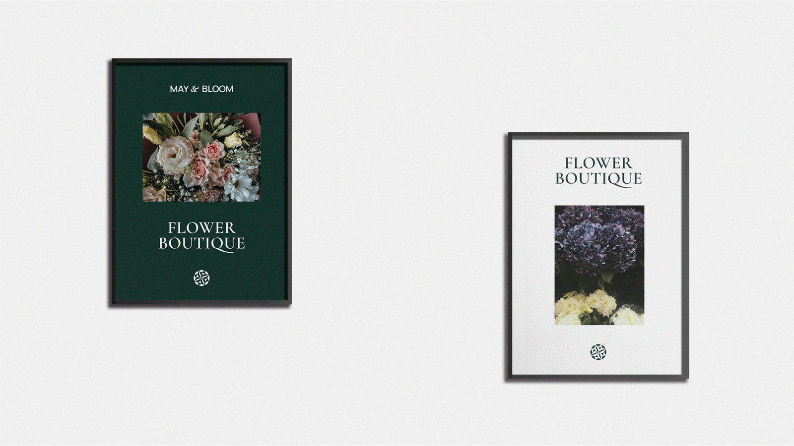
Visual image of a brand consists not only of a logo but also of matching colors, fonts and other elements of visual identity. Therefore, we created a consistent style for the entire brand, which allowed us to achieve coherence and develop brand recognition.


We rejected bright colors so as not to eclipse flowers, and laid stress on bouquets due to their expressiveness and harmony. Our choice was dark green. It evokes associations with nature, growth, harmonizes with the urban environment, which is perfect for the brand. The color itself is rich, and adds elegance to the brand, reflects professionalism and creates a sense of luxury.
The “Cormorant” font was chosen out of gracefulness and stylishness that fit in with the theme of the flower store. The smooth curves and fine lines associate the font with the fragile beauty and magnificence of flowers. The font adds sophistication to the brand image, emphasizes the uniqueness and beauty of floral arrangements.
As a result, we have the brand image that complements and distinguishes the brand, attracts customers and inspires their favor and loyalty – the consistent brand image accompanying May&Bloom’s amazing bouquets.


